Top Ten Minor League Baseball Logos – Ranked!
Editor note: Today's article is a contribution from AMSTS friend and reader, Tyler Stern.
It looks as if another baseball season is upon us. So that means we get to rank the minor league logos coming into the 2016 season! So sit back, relax and enjoy as we rank logo’s of teams you’ve probably never heard of.
10. Mahoning Valley Scrappers
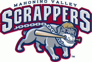 The scrappers are located in Niles, Ohio which you probably have never heard of unless you are from Niles, Ohio. Playing in the New York-Penn League in Short-Season A ball, this logo is ranked number ten for the sole reason that the dog biting a bat looks pretty damn cool.
9. Hickory Crawdads
The scrappers are located in Niles, Ohio which you probably have never heard of unless you are from Niles, Ohio. Playing in the New York-Penn League in Short-Season A ball, this logo is ranked number ten for the sole reason that the dog biting a bat looks pretty damn cool.
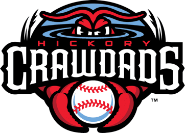
9. Hickory Crawdads
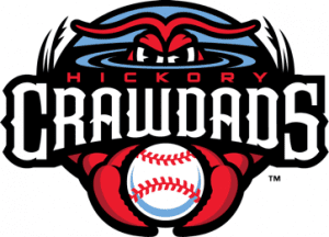 The Hickory Crawdads fall into 9th place in my poll. This logo is brand new as of this season and is a huge upgrade from their previous logo. I personally enjoy how the eyes put out a feeling of fear. Not a bad logo.
8. Hillsboro Hops
The Hickory Crawdads fall into 9th place in my poll. This logo is brand new as of this season and is a huge upgrade from their previous logo. I personally enjoy how the eyes put out a feeling of fear. Not a bad logo.
8. Hillsboro Hops
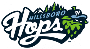 The Hops are a Short-Season A team affiliate of the Arizona Diamondbacks and are heading into their third season. Playing out of Hillsboro, Oregon, the location is in prime beer brewing territory, hence the Hops nickname. Overall, beautiful logo.
7. Richmond Flying Squirrels
The Hops are a Short-Season A team affiliate of the Arizona Diamondbacks and are heading into their third season. Playing out of Hillsboro, Oregon, the location is in prime beer brewing territory, hence the Hops nickname. Overall, beautiful logo.
7. Richmond Flying Squirrels
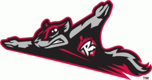 This isn’t a very new logo, but it is still pretty freaking awesome. The Squirrels are a Double-A team and affiliates of the San Francisco Giants. I never really understood this affiliation. Why make the players fly cross-country to get to the major-league club? Anyway, this logo is pretty cool. The originality of a flying squirrel makes this one number seven.
6. Normal CornBelters
This isn’t a very new logo, but it is still pretty freaking awesome. The Squirrels are a Double-A team and affiliates of the San Francisco Giants. I never really understood this affiliation. Why make the players fly cross-country to get to the major-league club? Anyway, this logo is pretty cool. The originality of a flying squirrel makes this one number seven.
6. Normal CornBelters
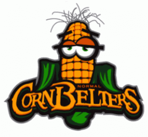 They are kind of a minor league team but not really. Straight outta Illinois, the Normal CornBelters play in the Frontier League. The Frontier League isn’t really minor league baseball but actually independent baseball. If you google their roster, you probably wouldn’t recognize one name. But it’s a damn good logo of a piece of corn that looks extremely inebriated.
5. Chattanooga Lookouts
They are kind of a minor league team but not really. Straight outta Illinois, the Normal CornBelters play in the Frontier League. The Frontier League isn’t really minor league baseball but actually independent baseball. If you google their roster, you probably wouldn’t recognize one name. But it’s a damn good logo of a piece of corn that looks extremely inebriated.
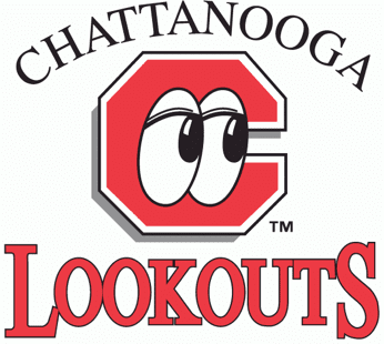
5. Chattanooga Lookouts
 Just an absolutely fascinating logo. The logo only made it this high on the list because of their awesome new uniforms. The eyes inside of the C make this logo number five and one of my personal favorites.
4. Frisco RoughRiders
Just an absolutely fascinating logo. The logo only made it this high on the list because of their awesome new uniforms. The eyes inside of the C make this logo number five and one of my personal favorites.
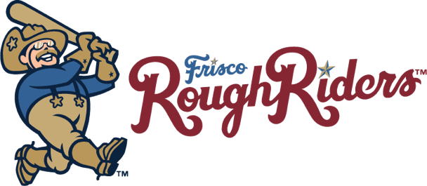
4. Frisco RoughRiders
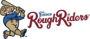 Just look at the beauty of President Roosevelt (probably) hitting a homerun. I really hope he bat flipped after. The logo just screams “Texas!” Definitely deserves to be number four on this list and is one of the best logos of minor league sports.
3. Hartford Yard Goats
Just look at the beauty of President Roosevelt (probably) hitting a homerun. I really hope he bat flipped after. The logo just screams “Texas!” Definitely deserves to be number four on this list and is one of the best logos of minor league sports.
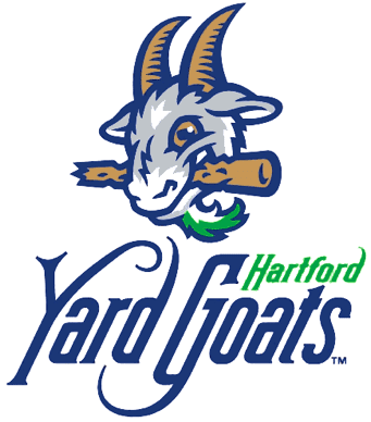
3. Hartford Yard Goats
 A brand new team in 2016, this is just phenomenal. Even Cal Ripken seemed to enjoy it! The font of the writing even incorporates the old Hartford Railroad script. The color scheme is a shoutout to the Hartford Whalers who sadly left Hartford for Carolina. Fantastic job on this one.
2. Montgomery Biscuits
A brand new team in 2016, this is just phenomenal. Even Cal Ripken seemed to enjoy it! The font of the writing even incorporates the old Hartford Railroad script. The color scheme is a shoutout to the Hartford Whalers who sadly left Hartford for Carolina. Fantastic job on this one.
2. Montgomery Biscuits
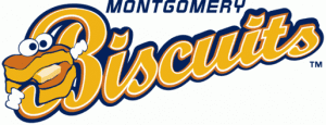 IT’S A BISCUIT! This isn’t a new logo at all but it is one of the best out there. I am hungry just looking at it. The font of the writing perfectly encompasses the logo to the left. Absolutely in love with this one.
1. El Paso Chihuahuas
IT’S A BISCUIT! This isn’t a new logo at all but it is one of the best out there. I am hungry just looking at it. The font of the writing perfectly encompasses the logo to the left. Absolutely in love with this one.
1. El Paso Chihuahuas
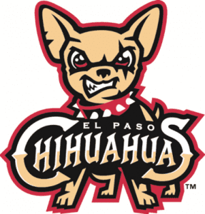 El Paso gets number one in my rankings for the beauty of this logo. A Triple-A affiliate of the Padres, the designers of this logo did a great job. The mean looking Chihuahua puts fear into the opponent’s eyes. The colors are perfect for El Paso. I love this logo and the angry Chihuahua.
Here’s to another great minor league season!
El Paso gets number one in my rankings for the beauty of this logo. A Triple-A affiliate of the Padres, the designers of this logo did a great job. The mean looking Chihuahua puts fear into the opponent’s eyes. The colors are perfect for El Paso. I love this logo and the angry Chihuahua.
Here’s to another great minor league season!
 The scrappers are located in Niles, Ohio which you probably have never heard of unless you are from Niles, Ohio. Playing in the New York-Penn League in Short-Season A ball, this logo is ranked number ten for the sole reason that the dog biting a bat looks pretty damn cool.
9. Hickory Crawdads
The scrappers are located in Niles, Ohio which you probably have never heard of unless you are from Niles, Ohio. Playing in the New York-Penn League in Short-Season A ball, this logo is ranked number ten for the sole reason that the dog biting a bat looks pretty damn cool.
9. Hickory Crawdads
 The Hickory Crawdads fall into 9th place in my poll. This logo is brand new as of this season and is a huge upgrade from their previous logo. I personally enjoy how the eyes put out a feeling of fear. Not a bad logo.
8. Hillsboro Hops
The Hickory Crawdads fall into 9th place in my poll. This logo is brand new as of this season and is a huge upgrade from their previous logo. I personally enjoy how the eyes put out a feeling of fear. Not a bad logo.
8. Hillsboro Hops
 The Hops are a Short-Season A team affiliate of the Arizona Diamondbacks and are heading into their third season. Playing out of Hillsboro, Oregon, the location is in prime beer brewing territory, hence the Hops nickname. Overall, beautiful logo.
7. Richmond Flying Squirrels
The Hops are a Short-Season A team affiliate of the Arizona Diamondbacks and are heading into their third season. Playing out of Hillsboro, Oregon, the location is in prime beer brewing territory, hence the Hops nickname. Overall, beautiful logo.
7. Richmond Flying Squirrels
 This isn’t a very new logo, but it is still pretty freaking awesome. The Squirrels are a Double-A team and affiliates of the San Francisco Giants. I never really understood this affiliation. Why make the players fly cross-country to get to the major-league club? Anyway, this logo is pretty cool. The originality of a flying squirrel makes this one number seven.
6. Normal CornBelters
This isn’t a very new logo, but it is still pretty freaking awesome. The Squirrels are a Double-A team and affiliates of the San Francisco Giants. I never really understood this affiliation. Why make the players fly cross-country to get to the major-league club? Anyway, this logo is pretty cool. The originality of a flying squirrel makes this one number seven.
6. Normal CornBelters
 They are kind of a minor league team but not really. Straight outta Illinois, the Normal CornBelters play in the Frontier League. The Frontier League isn’t really minor league baseball but actually independent baseball. If you google their roster, you probably wouldn’t recognize one name. But it’s a damn good logo of a piece of corn that looks extremely inebriated.
5. Chattanooga Lookouts
They are kind of a minor league team but not really. Straight outta Illinois, the Normal CornBelters play in the Frontier League. The Frontier League isn’t really minor league baseball but actually independent baseball. If you google their roster, you probably wouldn’t recognize one name. But it’s a damn good logo of a piece of corn that looks extremely inebriated.
5. Chattanooga Lookouts
 Just an absolutely fascinating logo. The logo only made it this high on the list because of their awesome new uniforms. The eyes inside of the C make this logo number five and one of my personal favorites.
4. Frisco RoughRiders
Just an absolutely fascinating logo. The logo only made it this high on the list because of their awesome new uniforms. The eyes inside of the C make this logo number five and one of my personal favorites.
4. Frisco RoughRiders
 Just look at the beauty of President Roosevelt (probably) hitting a homerun. I really hope he bat flipped after. The logo just screams “Texas!” Definitely deserves to be number four on this list and is one of the best logos of minor league sports.
3. Hartford Yard Goats
Just look at the beauty of President Roosevelt (probably) hitting a homerun. I really hope he bat flipped after. The logo just screams “Texas!” Definitely deserves to be number four on this list and is one of the best logos of minor league sports.
3. Hartford Yard Goats
 A brand new team in 2016, this is just phenomenal. Even Cal Ripken seemed to enjoy it! The font of the writing even incorporates the old Hartford Railroad script. The color scheme is a shoutout to the Hartford Whalers who sadly left Hartford for Carolina. Fantastic job on this one.
2. Montgomery Biscuits
A brand new team in 2016, this is just phenomenal. Even Cal Ripken seemed to enjoy it! The font of the writing even incorporates the old Hartford Railroad script. The color scheme is a shoutout to the Hartford Whalers who sadly left Hartford for Carolina. Fantastic job on this one.
2. Montgomery Biscuits
 IT’S A BISCUIT! This isn’t a new logo at all but it is one of the best out there. I am hungry just looking at it. The font of the writing perfectly encompasses the logo to the left. Absolutely in love with this one.
1. El Paso Chihuahuas
IT’S A BISCUIT! This isn’t a new logo at all but it is one of the best out there. I am hungry just looking at it. The font of the writing perfectly encompasses the logo to the left. Absolutely in love with this one.
1. El Paso Chihuahuas
 El Paso gets number one in my rankings for the beauty of this logo. A Triple-A affiliate of the Padres, the designers of this logo did a great job. The mean looking Chihuahua puts fear into the opponent’s eyes. The colors are perfect for El Paso. I love this logo and the angry Chihuahua.
Here’s to another great minor league season!
El Paso gets number one in my rankings for the beauty of this logo. A Triple-A affiliate of the Padres, the designers of this logo did a great job. The mean looking Chihuahua puts fear into the opponent’s eyes. The colors are perfect for El Paso. I love this logo and the angry Chihuahua.
Here’s to another great minor league season!